Header & Search Bar
The ‘Header & Search Bar’ section controls the look and feel of both desktop and mobile navigation bars.
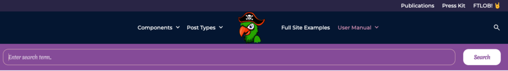
There are three main subsections within the navigation bar, namely:
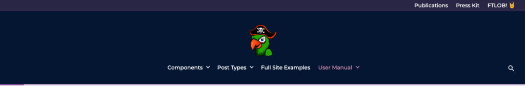
- An optional eyebrow header, as displayed at the very top of the image below. This header will hide as the user scrolls down the page on desktop devices, but remain in view on mobile devices, providing a spot for links to supporting info, such as contact pages, FAQs, and if applicable, social media profiles.
- A main navigation bar, which may be displayed in one of 5 available styles (these will be discussed in detail)
- A search bar, visible once the user clicks on the ‘Search’ icon to the right of the main navigation bar, displayed within the image below in light purple.
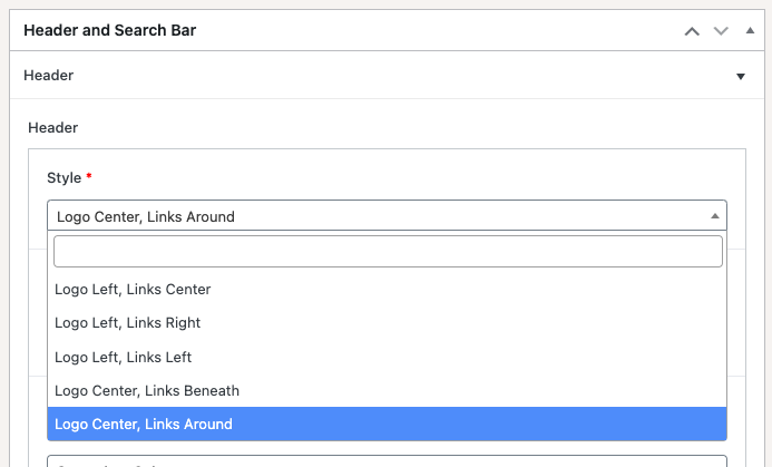
Header Style
When configuring the ‘Header & Search Bar’ section, one of the available settings is the Header Style dropdown, containing 5 distinct header styles. The following screenshots provide an idea of what each of these styles could look like.
Logo Left, Links Center

Logo Left, Links Right

Logo Left, Links Left

Logo Center, Links Beneath
Logo Center, Links Around

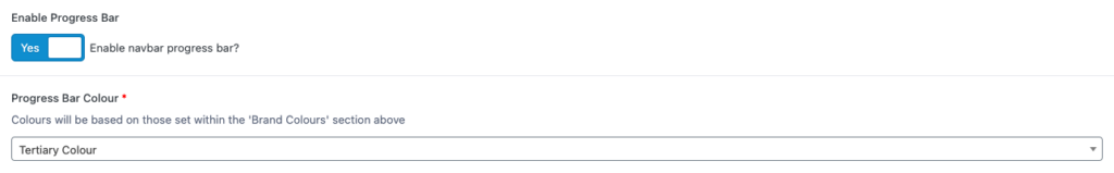
Progress Bar
The progress bar is an optional bar at the bottom of the header, whose colour may be configured. If this feature is enabled, the bar’s width will change as the user scrolls up/down the page, to indicate the percentage of the page which has been scrolled through.

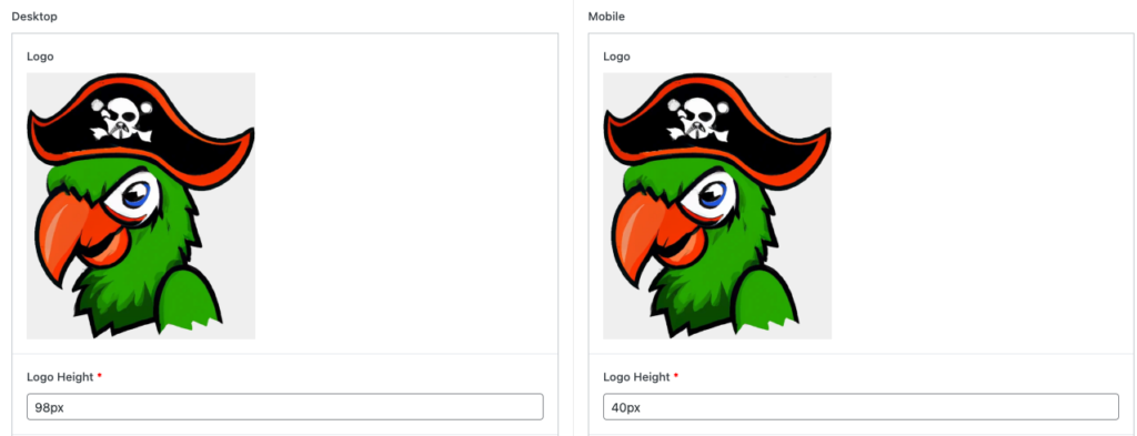
Desktop / Mobile Logo Settings
Should the need arise, this theme provides the facility to set a mobile logo which is different to the logo set on desktop. This is especially useful for logos with text within them which may not be as sharp and legible when viewed on smaller devices; in which case you may wish to display a slightly modified logo on mobile resolutions. Should this not be the case, you may also choose to display the same logo for both desktop and mobile devices, but at different heights, as displayed below.
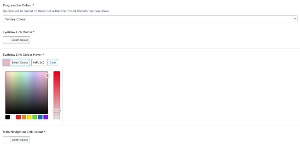
Header Colours
The ‘Header & Search Bar’ section also provides the facility to set various background, text, and hover colours applicable to the header. Most of these options may be set via dropdown, based on colours defined within the Brand Colours section, whilst others may be set via colour wheel to allow added customisation.
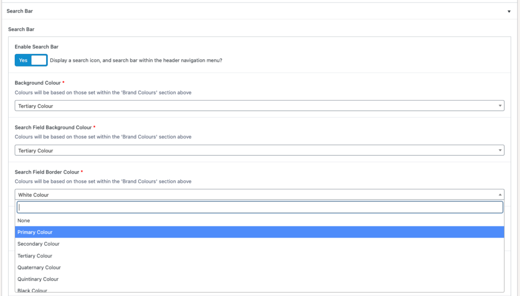
Search Bar
The ‘Search Bar’ accordion at the bottom of the page allows administrators to choose whether to include search functionality (in which case, a search icon will be displayed on the right side of the main navigation), along with determining the search bar’s style should this functionality be enabled.
Search Bar style includes options such as background, border, and text colours, along with configuration of the search field placeholder text, e.g. ‘Enter search term..’, as well as Search button label, e.g. ‘Search’