Buttons & Miscellaneous
The ‘Buttons & Roundedness’ section provides administrators with the ability to alter button styles, adjust roundedness of various on-site components (including buttons), as well as controlling the box-shadow applied to components on the website. (Note that the latter will require some basic css knowledge).
Options within this section include:
- Button Text Colour: Determines text colour for solid buttons (background colour, as well as text colour for all other non-solid button styles is set individually on a per-component basis).
- Button Padding Horizontal: Determines left and right spacing for solid and outline buttons. Ensure that you add a unit of measure (px / em / rem) to the input value.
- Button Padding Vertical: Determines top and bottom spacing for solid and outline buttons. Ensure that you add a unit of measure (px / em / rem) to the input value.
- Button Border Thickness: Determines border thickness on outline buttons, along with underline thickness of underline buttons
- Roundedness: Determines the border radius of outline and solid buttons, together with other website assets, such as images within the image + text components, accordions, desktop navigation bar dropdowns, and form input/textarea/checkbox fields.
- Theme Drop Shadow: Determines box-shadow of applicable assets on site, including but not limited to accordion pods, text + image pods, component images, and news / search / team member pods.
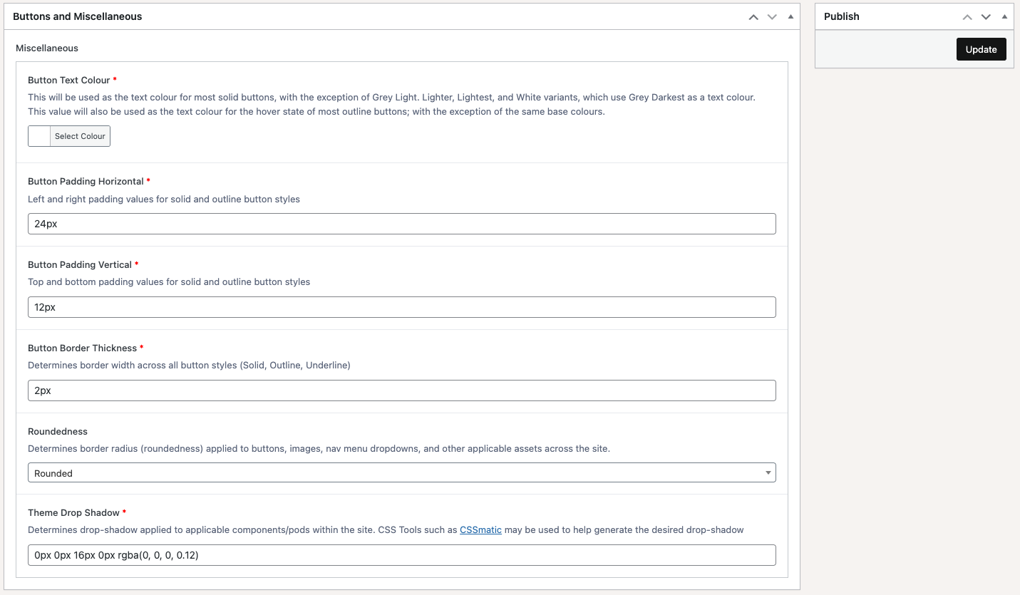
Once any of these settings have been updated, remember to click on the ‘Update’ button at the top-right of the screen in order to save any changes.