Component Guide
Banner - Carousel
The Carousel Banners component allows you to create visually appealing hero banners with multiple full-sized image slides. Each slide can feature an optional title, description, and a link button, giving you flexibility in presenting key information.
This component offers a range of configuration options, grouped into the following categories:
| Settings | This section contains general settings applicable to all components, including:
|
|---|---|
| Animation | Choose how the carousel banner enters the page. There are seven animation options available:
|
| Slider Configuration | This section allows you to fine-tune the behaviour and appearance of the carousel:
|
| Content | This section lets you add, remove, or reorder individual slides within the carousel.
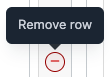
To Add a SlideClick the ‘Add Item’ button at the bottom-right of the component. A new row will appear at the bottom of the content table, where you can input information for the slide, such as the title, content, and button details. To Remove a SlideHover over the slide row you wish to remove and click the (-) button that appears on the far-right. A confirmation prompt will ensure that you want to delete the slide.
To Reorder a SlideHover over the left-hand side of the slide row you want to move. When the cursor changes to a crosshair, you can drag and drop the slide into the desired position. |
You can view examples of Carousel Banners with different styles and animations here.