Components
Components are reusable building-block sections that may be added and configured on a per page basis. Configuration and content population may be handled directly within the required page by filling in a few fields related to that component. Each component may be fully customised in order to match your brand’s look and feel. Have a look at our Full Site Examples in order to better gauge the level of cross-brand applicability of the theme.
Alternatively, documentation for each available component within the them theme may be found below.
To Add a Component
From the website’s frontend, after having logged in to the CMS, navigate to the page you would like to create a component within, and click on the ‘Edit Page’ button within the administrator’s bar at the top of the screen, or add a new page through the same bar; as highlighted within the below screenshot.

This will direct you to a CMS screen, containing all information related to the page in question. Towards the bottom of this CMS page, you should spot a ‘Components’ section, which would contain configurations for any pre-existing components for the page. In the event that you have chosen to add a new page, this section will be empty, as shown below:
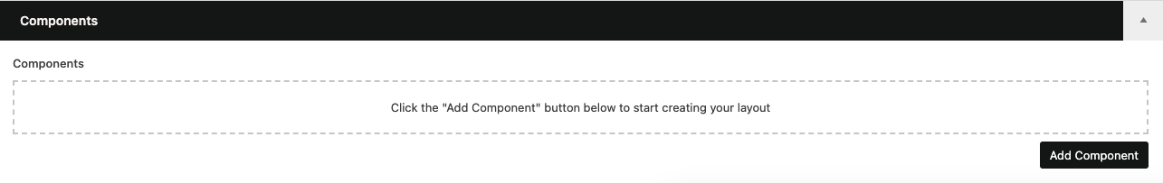
Clicking on the ‘Add Component’ button at the bottom-right of the section will reveal a menu containing a list of all available components within the theme. Selecting the component you would like to add from this menu will add it into the Components section, ready for any necessary configuration tweaks.
Note that if you would like to add a component in a specific order to a page within which a number of components already exist, you may hover over the component above which the new component needs to be added, and click on the ‘Add Component Above’ button outlined below, in order to better control component order.

As with the standard ‘Add Component’ button, clicking on this icon will display a list of available components to choose from.
To Duplicate a Component
You may encounter a scenario where a page has many similar components within it. Rather than adding and configuring each component individually, WordPress provides the facility to fully configure the first component, then duplicate it for as many times as necessary, changing content from one component to the next as needed.
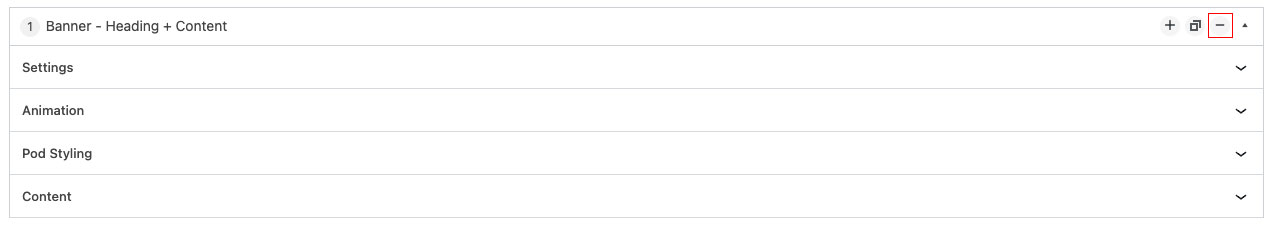
To do so, once your first component has been added and configured, hover over it, and have a look at the top-right of the component, where 4 icons should then be visible.

The second of these icons, as outlined in red above, is the ‘Duplicate’ button, which when clicked will create an identical clone of the selected component, which you would then be able to adjust as needed prior to clicking on the ‘Update’ button in order to publish any changes to the page.
To Remove a Component
Components which need to be removed from a page may be removed through the page’s CMS screen. When editing the page, scroll to the component which you would like to remove, and hover over this component.
Doing so will reveal a set of icons at the top-right of the component.
Clicking on the third icon, as outlined above, will present a tooltip, prompting you to confirm that you would like to remove that component.
To Reorder a Component
Components added to a page may be reordered to better convey the desired messaging, or page appearance.
To reorder a set of components, navigate to the page’s CMS screen, and scroll to the component section. Individual components may be dragged and dropped into the desired order.
In the event that a page has a large number of components, the collapse icon at the top-right of each component (as outlined below) may be used to minimise the footprint taken up by each component, making it easier to drag individual components to the correct spot with minimal scrolling.


SR Only Title
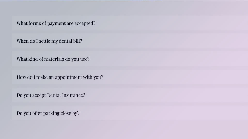
Accordions
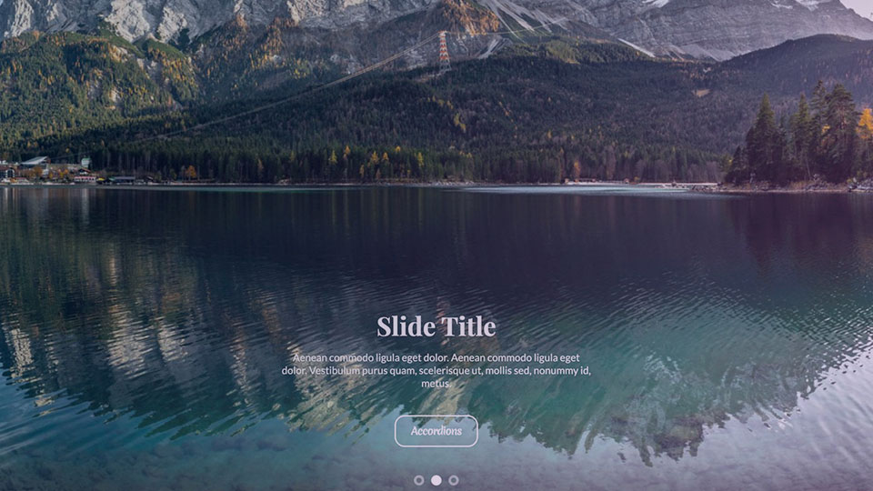
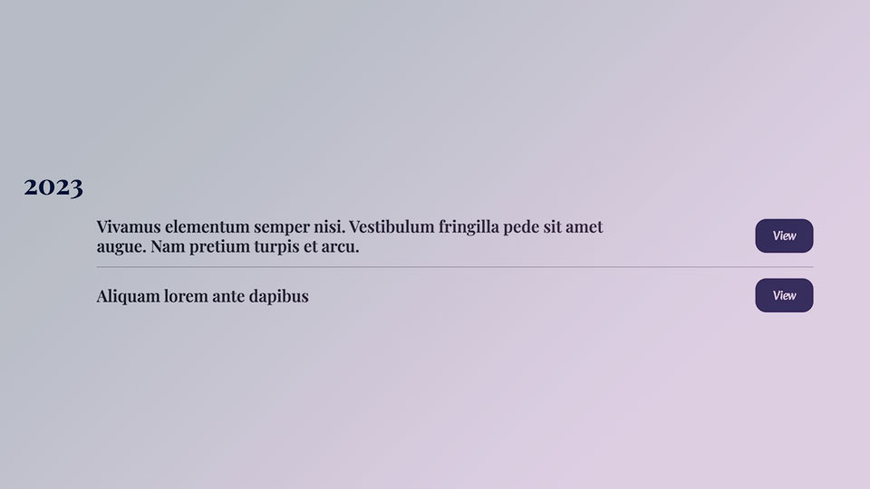
Banner - Carousel
Banner - Full Width Background Image

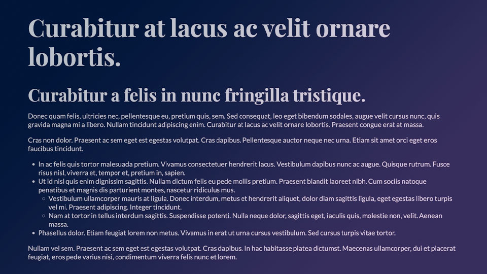
Banner - Heading + Content
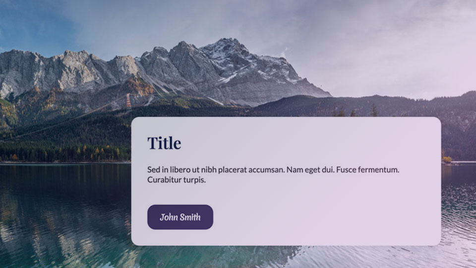
Banner - Image + Content

Banner - Image

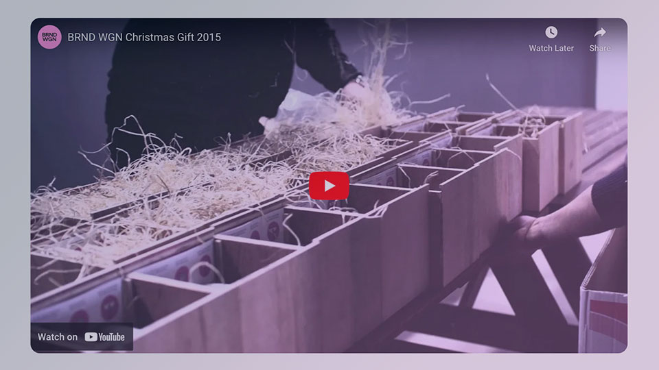
Banner - Video

Carousel - Gallery
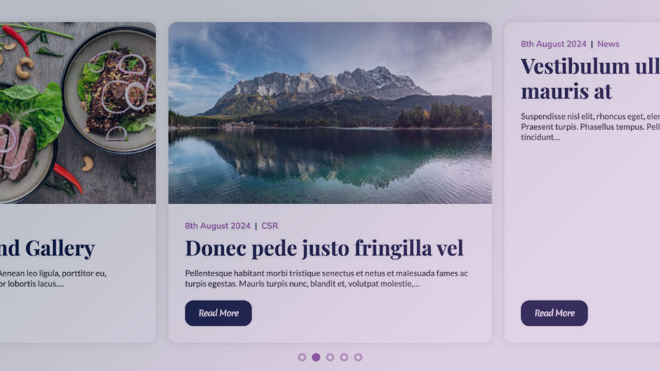
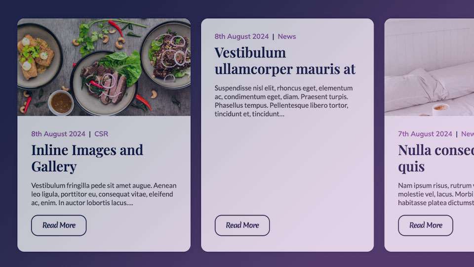
Carousel - Latest News

Carousel - Testimonials
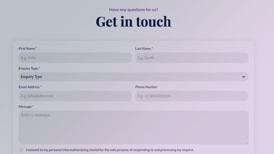
Contact Form - Center Aligned
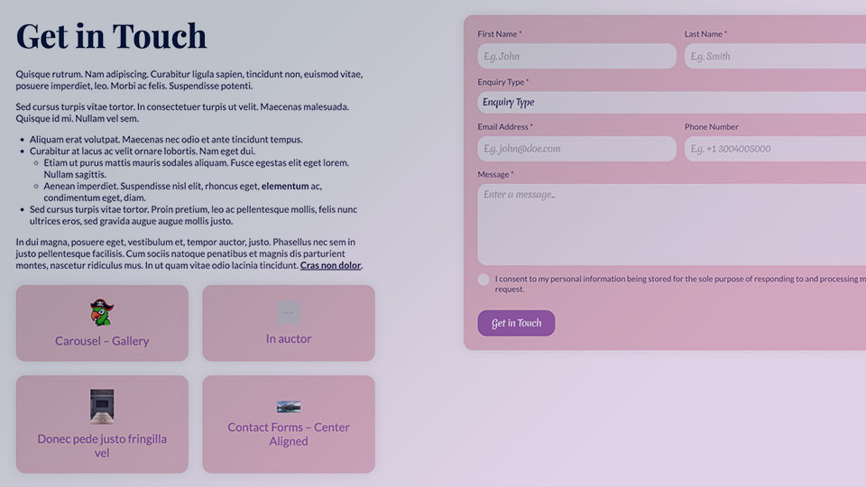
Contact Form Right + Quicklinks Left
Embed
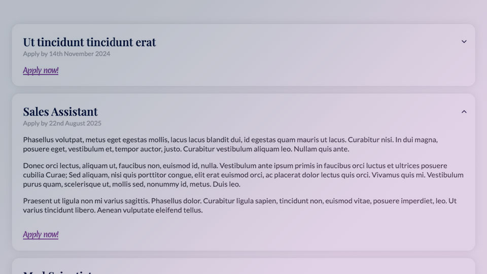
Grid - Careers

Grid - Gallery
Grid - Latest News
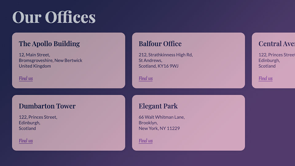
Grid - Linkable Pods
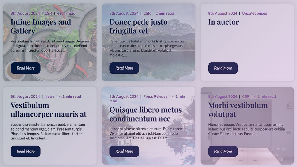
Grid - Posts
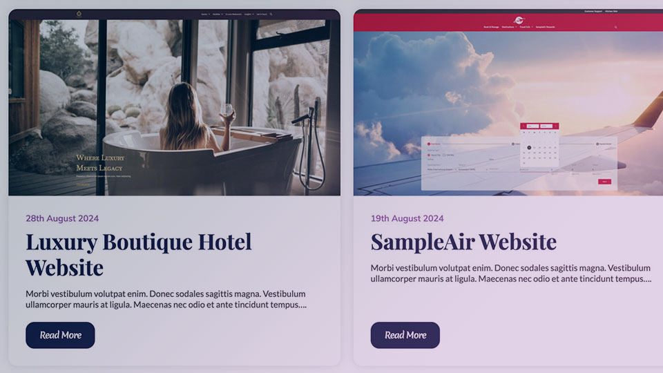
Grid - Projects
Grid - Publications / Press Kit

Grid - Team Members
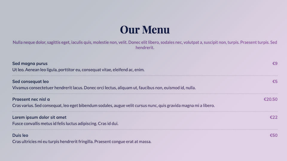
Price List

Row of CTAs
Spacer
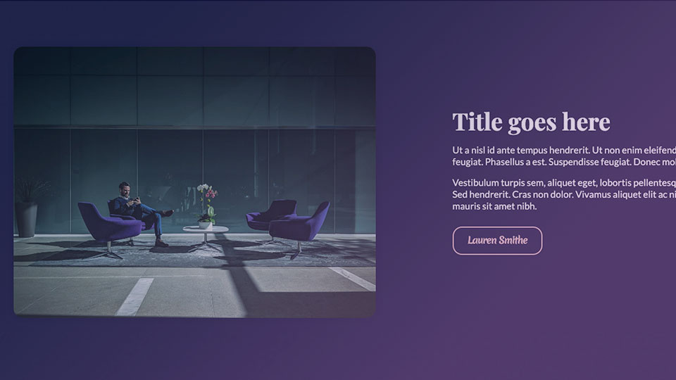
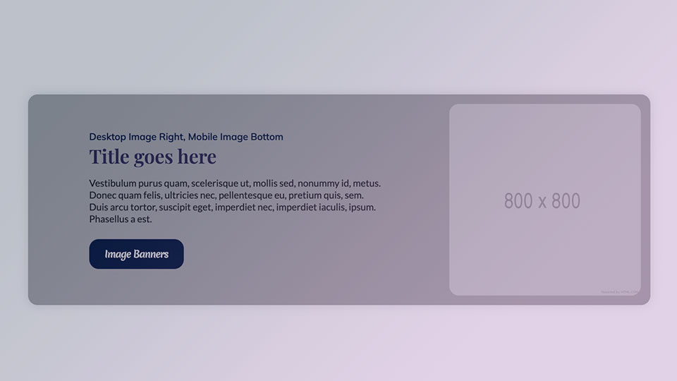
Text + Image