Linkable Pods Grid
The ‘Grid – Linkable Pods’ component is a flexible component which allows administrators to link to other on-site, or external resources.
The customisability is vast, allowing admins to choose the number of pods per column (with options ranging from 1 to 4), the width of the section, whether to include images within pods, whether those images should be placed above; or alongside each pod’s text, and whether to include icons above text within pods; and if so, the size of these icons.
The below example showcases a set of pods with no images, displayed within a 3 column grid.
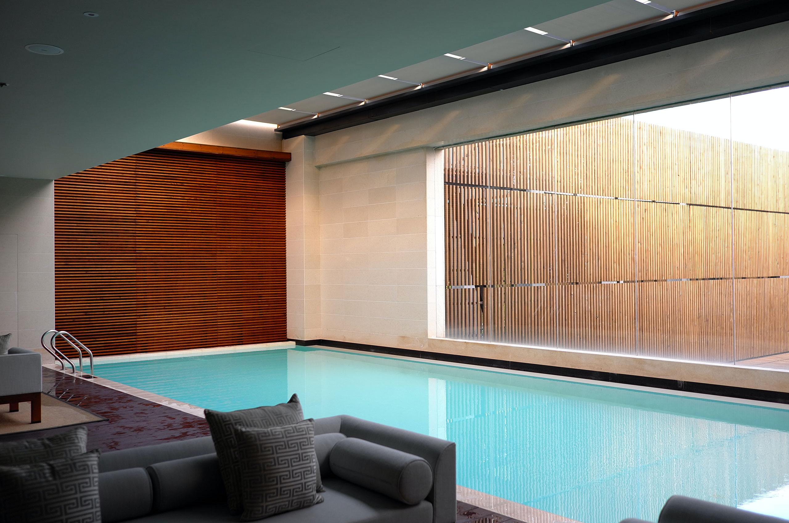
Our Offices
While the above showcases the 3 column grid, the below outputs the same content within a 4 column grid.
Administrators may add images, and icons on a per-pod basis within this component. The following example shows two pods with images added alongside the pod text. The first of these pods has also been assigned an icon.
As can be seen from the third link within this component, even though the component is called ‘Grid – Linkable Pods’, links within these pods are completely optional.

Test
Donec venenatis vulputate lorem. Vivamus aliquet elit ac nisl. Donec quam felis, ultricies nec, pellentesque eu, pretium quis, sem.
A second test
Etiam sollicitudin, ipsum eu pulvinar rutrum, tellus ipsum laoreet sapien, quis venenatis ante odio sit amet eros. In consectetuer turpis ut velit. Suspendisse non nisl sit amet velit hendrerit rutrum. Vivamus quis mi.
Third Pod
Praesent turpis. Sed magna purus, fermentum eu, tincidunt eu, varius ut, felis. Nullam nulla eros, ultricies sit amet, nonummy id, imperdiet feugiat, pede. Vivamus euismod mauris.
The final use-case demonstrates a scenario similar to the above, with 4 columns per row rather than 3, and with images aligned above the pod text.
Test
Donec venenatis vulputate lorem. Vivamus aliquet elit ac nisl. Donec quam felis, ultricies nec, pellentesque eu, pretium quis, sem.
A second test
Etiam sollicitudin, ipsum eu pulvinar rutrum, tellus ipsum laoreet sapien, quis venenatis ante odio sit amet eros. In consectetuer turpis ut velit. Suspendisse non nisl sit amet velit hendrerit rutrum. Vivamus quis mi.
Third Pod
Praesent turpis. Sed magna purus, fermentum eu, tincidunt eu, varius ut, felis. Nullam nulla eros, ultricies sit amet, nonummy id, imperdiet feugiat, pede. Vivamus euismod mauris.