The Testimonial Carousel component allows you to showcase curated testimonials in a sliding carousel format, with customisable options for each instance of the component.
This component offers several configuration options, organised into the following categories:
| Settings |
This section contains general settings that apply across all components within the system:
- Hide on Mobile/Tablet/Desktop: Pick whether to hide, or show this component independently on mobile, tablet, and desktop resolutions via a set of three checkboxes.
- Desktop/Mobile Padding: Adjust the top and bottom padding for both desktop and mobile views.
- Section Background Colour: Choose a background colour from a pre-configured list of brand colours.
|
| Animation |
Administrators can choose from seven entrance animation options for the testimonial carousel:
- None
- Slide in from the top
- Slide in from the bottom
- Slide in from the left
- Slide in from the right
- Fade in
- Grow in
|
| Slider Configuration |
This section allows administrators to configure the behaviour and appearance of the testimonial slider:
- Slide Duration: Set how long each testimonial remains visible before transitioning to the next. The default duration is 6 seconds. Hovering over or interacting with a slide pauses the timer.
- Icon Colour: Choose the outline and background colours for the slide indicators from a list of pre-configured brand colours.
- Slides to Show (Mobile Horizontal): Set the number of visible slides on resolutions between 768px and 1023px. For resolutions narrower than 768px, only one slide will be shown.
- Slides to Show (Tablet): Set the number of visible slides on resolutions between 1024px and 1279px.
- Slides to Show (Small Desktop): Set the number of visible slides on resolutions between 1280px and 1535px.
- Slides to Show (Large Desktop): Set the number of visible slides on resolutions wider than 1535px.
|
| Pod Styling |
This section allows administrators to customise the look of each testimonial pod:
- Pod Background Colour: Set the background colour for the image and text pod. This may differ from the background colour of the overall component. Option values are based on a pre-configured list of brand colours.
- Title Colour: Choose the text colour for the testimonial title from the list of pre-configured brand colours.
- Title Style: Select the heading size for the title, options range from Heading 1 to Small Paragraph.
- Text Colour: Set the text colour for the testimonial content. Option values are based on a pre-configured list of brand colours.
|
| Content |
Administrators can add, remove, and reorder individual testimonial slides in this section:
To Add a Slide
Click the ‘Add Item’ button at the bottom-right of the component.

This will add a new row to the content table, with input fields for the testimonial’s content and display options.
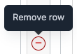
To Remove a Slide
Hover over the slide row to be removed and click the (-) button on the far-right of the row. A confirmation prompt will ensure the removal is intended.
To Reorder a Slide
Hover over the left side of the row (above the row’s number) until the cursor changes to a crosshair. Then, drag and drop the row to the desired position. |
You can view examples of Testimonial Carousels with various styles and animations here.