Component Guide
Accordions
The Accordion component allows you to present information within collapsible containers. This is especially useful for FAQs or long pages where users can toggle section visibility making it easier for them to find what they need quickly.
This component offers several configuration options, divided into the following categories:
| Settings | This section contains general settings that apply to all components across the system. These include:
|
|---|---|
| Animation | Here, you can choose how the accordion will appear when the page loads. There are seven animation options available:
|
| Pod Styling | This section allows administrators to style individual accordion sections (or “pods”). Options include:
|
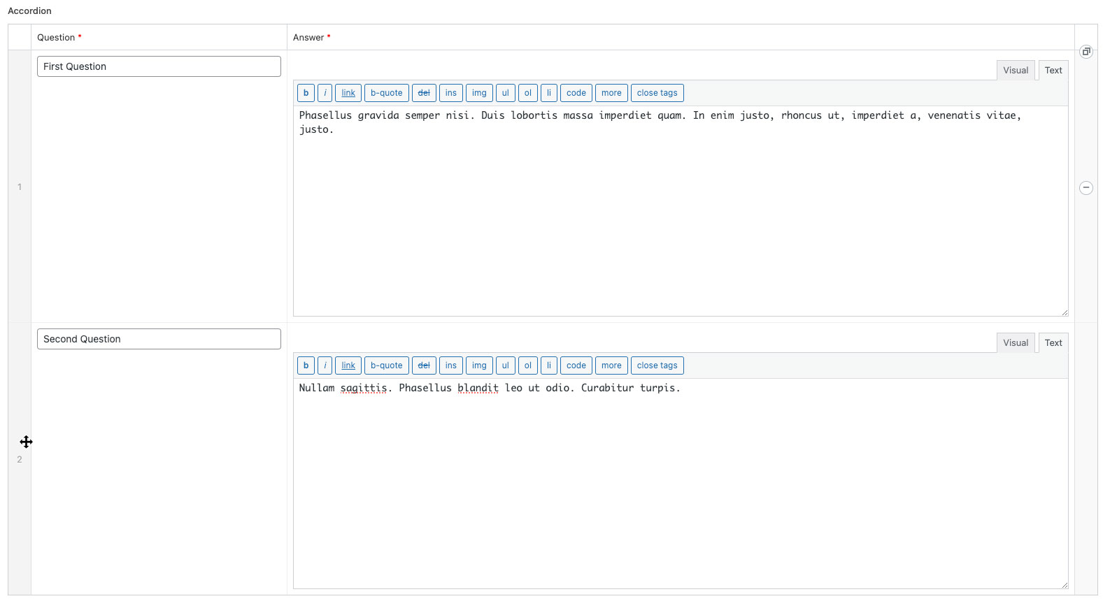
| Content | This section allows you to add, remove, or reorder accordion rows within the component.
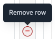
To Add an Accordion RowClick the ‘Add Item’ button at the bottom-right of the component. This will insert a new accordion row at the bottom of the list. Two input fields (for ‘Question’ and ‘Answer’) will be provided for each row, which will serve as the title and content of the accordion. To Remove an Accordion RowHover over the row you wish to remove and click the (-) button that appears on the far right. A confirmation prompt will appear to ensure you want to delete the row.
To Reorder an Accordion RowTo move an accordion, hover over the left side of the row (above the number). When the cursor changes to a crosshair, drag and drop the row into the desired position.
|
You can see various examples of the Accordion component, with different styles and animations here.