Gallery Grid
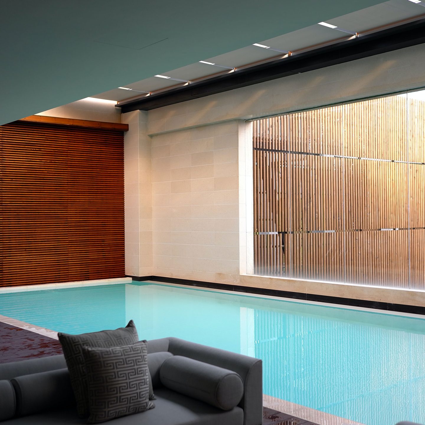
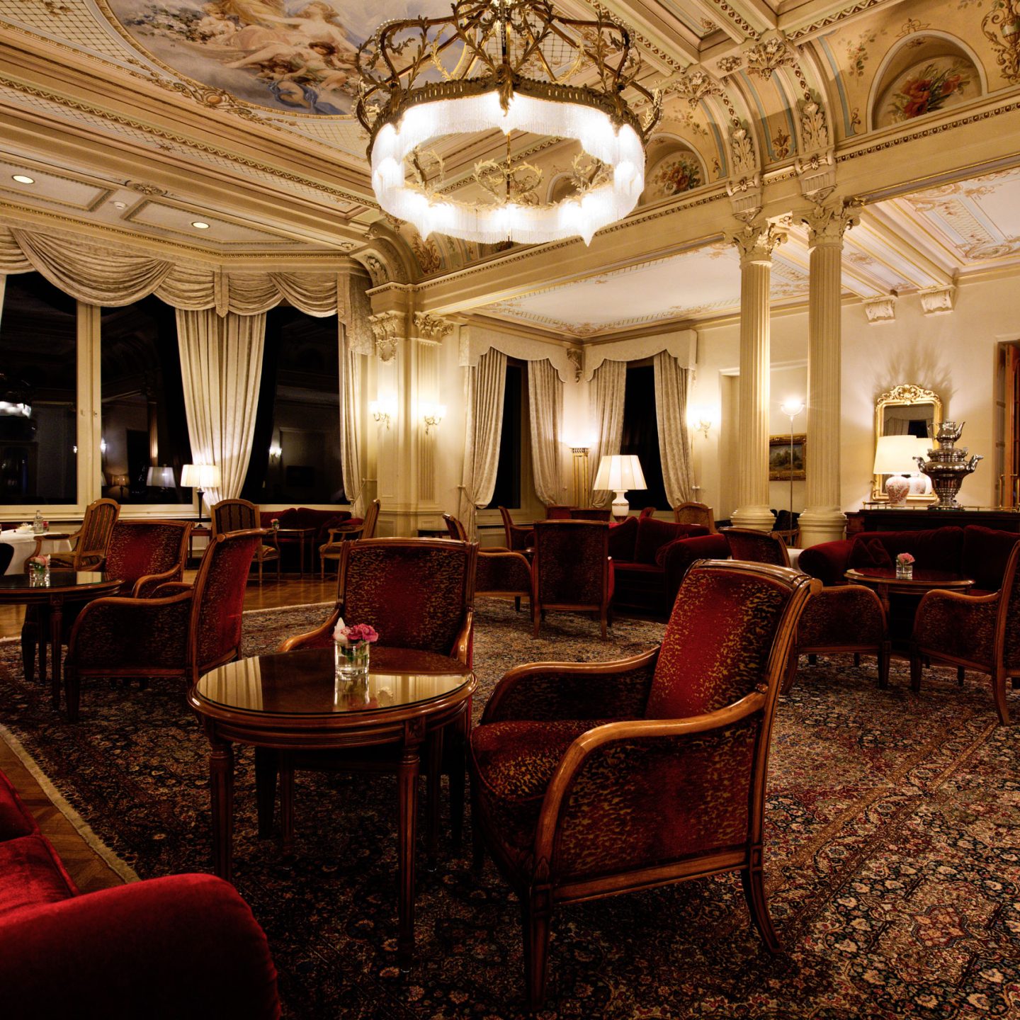
The Gallery Grid component allows administrators to add any number of images into a gallery to display within the page.
Galleries may be set to either occupy the full width of the browser, or to be contained within a maximum width container.
Captions may be set for all gallery images, in which case, upon hovering over an image with a caption, an overlay is displayed over the image, within which the caption may be visible.
Moreover, clicking on any item within the gallery will toggle a popup containing all the gallery’s images, allowing users to get a better look at each individual image.
Caption overlay text alignment and colours may be adjusted via the CMS. While the above example showcases a dark blue overlay background with right-aligned white text, the below features centre aligned blue text on a white background.
The below example also presents a gallery component which is not full width.
Gallery components which are not set to occupy the full browser width may be assigned a section width, with four available options. While the above is set to display using the widest available section width; the below gallery is being displayed through a slightly narrower option.
Administrators may also pick how many images to display on every row of the grid. The above two examples presented four images per row; while the below has 3 images per row; other options include 6 images per row and 2 images per row.


